I found a rather interesting read on LinkedIn of visualizing my LinkedIn network and thought why not give it a try. The overall site can be found here: Visualizing my LinkedIn Network. A few things to note when I was working through this have been added below. I have added the Python Code I used in Jupyter Notebooks. Working through this I found that I needed to layer in some additional code that did not exist in the original post. Below is the end result and the steps of how to do it are further down.
Here is a listing of the packages I needed in order to get this all done and posted on my blog. Some did require me to install and since I am using Anaconda I use the ‘conda install -c’ command.
pandas
plotly
plotly.express – https://anaconda.org/plotly/plotly_express
chart_studio – https://anaconda.org/plotly/chart-studio
First and foremost we need to get the data from Linkedin and then load it into Python for analysis. In your Settings area under Privacy you can click on “How LinkedIn uses your data” and there you can click on “Getting a copy of your data”.
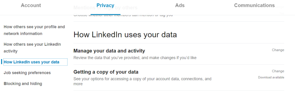
Then you will want to click on the second radial and checkbox “Connections.” You will then click on Request Archive. It takes ~10 minutes before the data is available. Once it is then download it and you are off to the races.
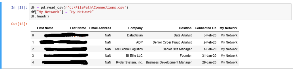
Step 1 is importing pandas so that you can work with data frames.

Next is importing the data and creating an additional variable to be used in the treemap called ‘My Network’. I did have to remove some blanks, but I did that in excel because the file was not really that big.
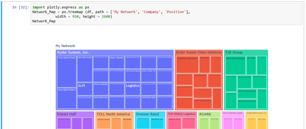
Then comes the fun part, the treemap.
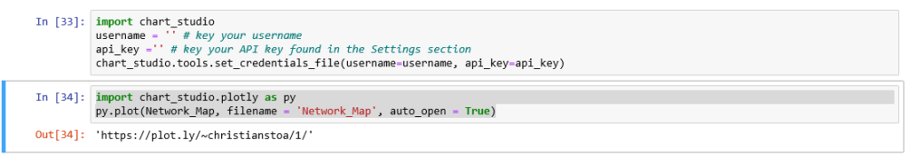
The next part was so I could embed the interactive chart into this blog page. Not a require per say, but worth adding to the process here. This did require me setting up an account on Plot.ly and getting the API Key which can be found in the Settings section of their website once you create an account. The second block of code will upload the chart to the website and will open a window for you to see it in your web browser. Then you can get the embed code. I got this bit of information from the below link by Elizabeth Ter Sahakyan.
How to Create a Plotly Visualization and Embed it on Websites
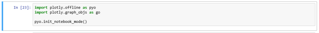
Lastly, I wanted to be able to export all of this as an HTML file which did not work. So, a quick google search lead me to a Stackoverflow post that had the below code noted. Unfortunately, the export to html would not include the Plotly visual.
Stackoverflow Article
This was my first attempt at a plot.ly chart in python. One skill that is often overlooked is being able to form your questions in google to get the results you need. Happy visualization’ing.
Sources:
https://towardsdatascience.com/visualizing-my-linkedin-network-c4b232ab2ad0
https://towardsdatascience.com/how-to-create-a-plotly-visualization-and-embed-it-on-websites-517c1a78568b
https://stackoverflow.com/questions/52771328/plotly-chart-not-showing-in-jupyter-notebook
https://anaconda.org/plotly/chart-studio
https://anaconda.org/plotly/plotly_express
https://plot.ly/python/treemaps/