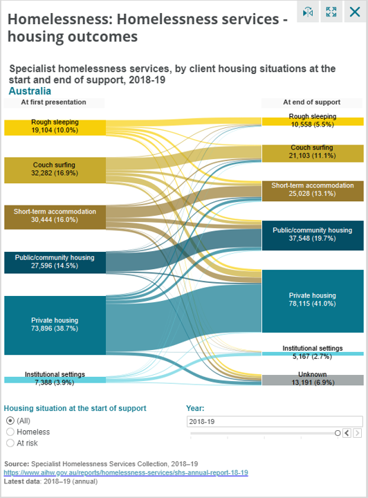
This week’s Makeover Monday viz was about Homelessness in Australia. The original viz was really good and one that I liked a lot. So much so that I wanted to take the Sankey visual and expand on it by adding some additional items that provide more insights.
In addition to the Sankey chart I wanted to make sure that there was some understanding as to what happened over time.
The first chart is simple column chart that shows Homeless and At Risk over the time frame of the data set.
The second was a Stacked 100% Bar Chart that highlights the make up of each type of housing.
I also added a story visual which I found in the Visual Marketplace for Power BI. The visual allows for dynamic numbers embedded in the text.
SOURCE ARTICLE: Housing data dashboard (specific view of the Sankey solution; more general view see www.housingdata.gov.au)
DATA SOURCE: Specialist homelessness services annual report 2017–18 (Note that the attached is an adjusted file which has all the years needed to replicate the ‘Australia’ build in the dashboard – the link is to a single financial year of data only)
Sankey Chart: https://appsource.microsoft.com/en-us/product/power-bi-visuals/WA104380777?tab=Overview
Data Story: https://appsource.microsoft.com/en-us/product/power-bi-visuals/WA104380950?tab=Overview