This week was a great data set. The original image had several small pie charts, personally I am not a fan of pie charts. The difficulty with the pie charts is that it is hard to tell the difference between subtle changes. Bar Charts provide more ease.
My theme was a play on the song War by Edwin Starr, a great song. Originally my sketch design had a gauge chart, but unfortunately Tableau does not offer that out of the box. I did find a way to do one, but there were quite a few steps and thought I could get what I wanted out of something a little simpler. Here is the link to the gauge chart if you wish to explore it, http://duelingdata.blogspot.com/2017/09/how-to-gauge-chart-in-tableau-updated.html.
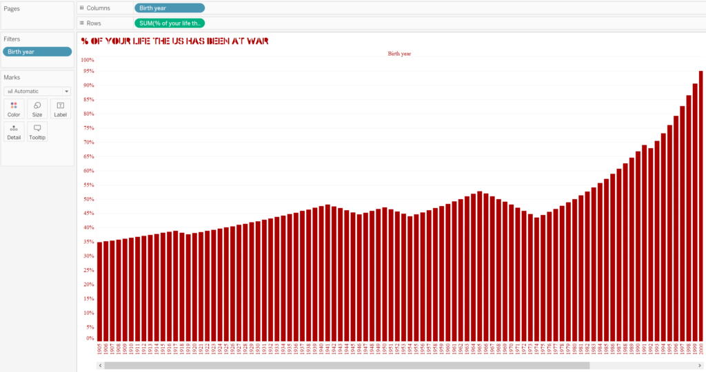
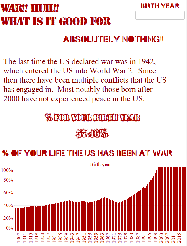
When I imported the data into Tableau the Year column converted to a whole number, I changed this to a String type in order to load it better. My first chart is a bar chart showing the % at War by Birth Year. I selected a blood red color for impact. Additionally, I went to DaFont.com and searched for War, downloaded a few different fonts.
The other visual I wanted to add to the dashboard was going to be a gauge chart, but I decided against it since it was not something that is native to Tableau. Instead I went with a simple table that is driven on a filter.
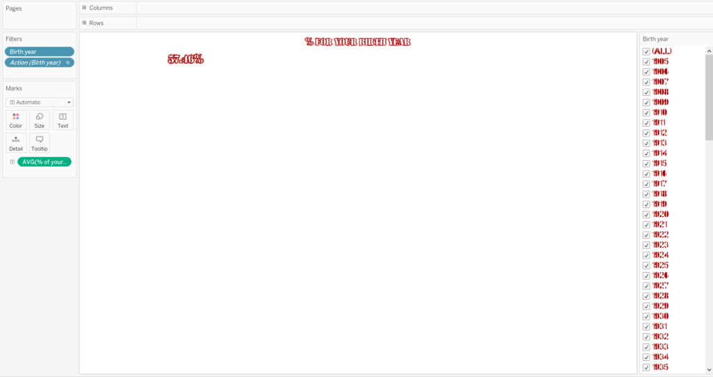
The final result is a very simple and clean looking dashboard that one can key their birth year in the top right and the % in the small table will change.
Interactive Link: