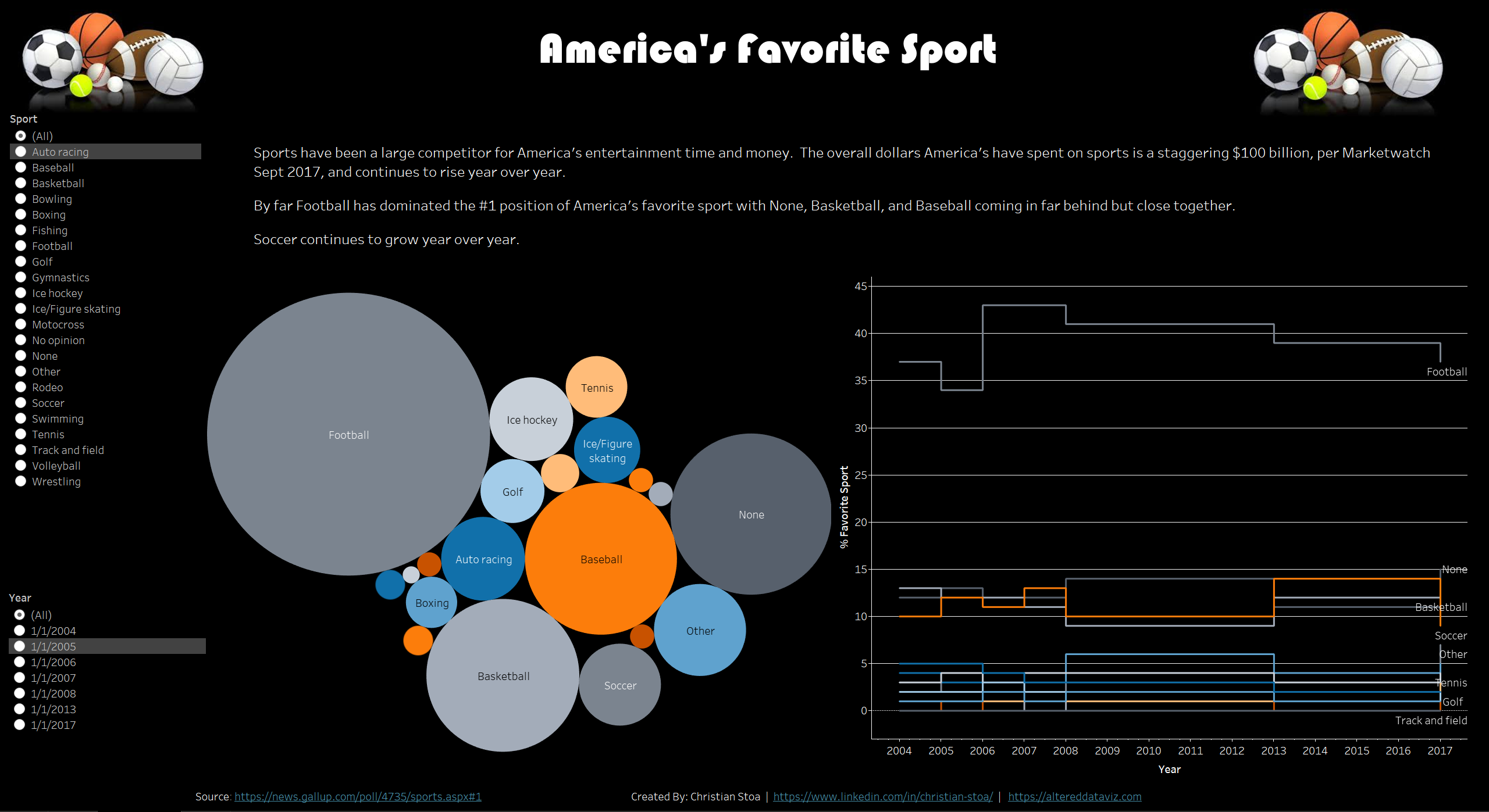
Makeover Monday Week 1
So, this is a little out of order in terms of posting. But, I thought I should take a stab at it anyways. Also, this is the first time in quite some time that I used Tableau Public. While it took a minute to remember everything I was up and going pretty quickly. The dataset that I had to work with was from Gallop and wasn’t in a format that I found the best in terms of getting some good visual out of.
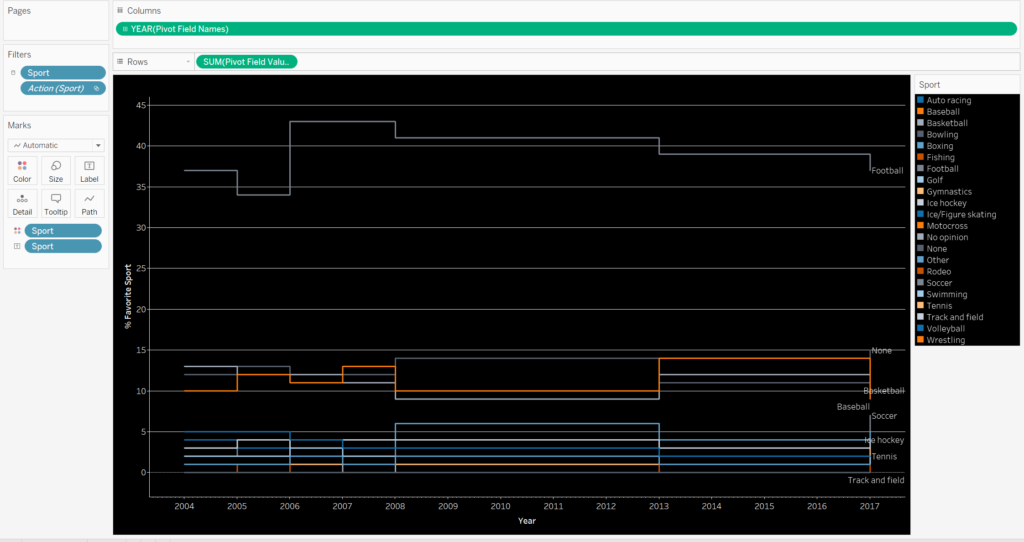
My first step was to do what is called Pivot in Tableau, similar in nature to Excel or PowerBI, however in those it might be more like UnPivot. The reason I did this is because the Years were the variables, but I needed them to be attributes. This narrowed the dataset into three columns, or variables; Year, % Reported as Favorite, and Sport. This format allowed for me to change the Year into a date format from the Text it was initially.
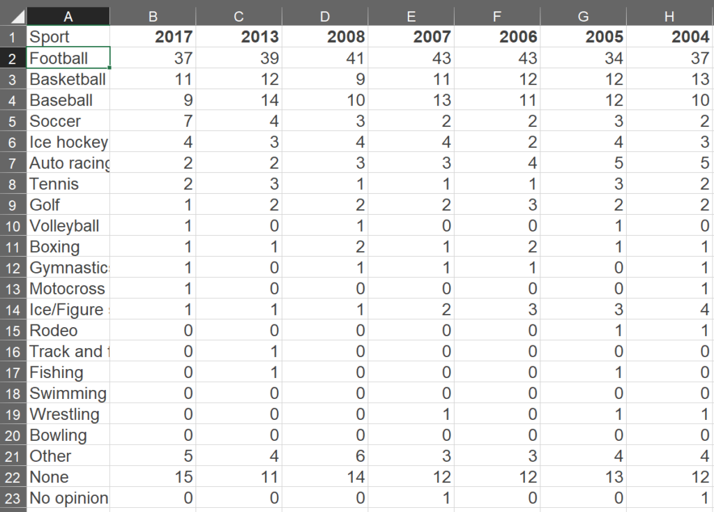
The below is the initial setup of the data.
The below is the transformed data.
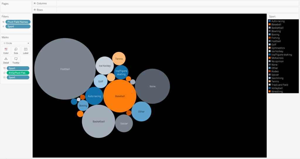
From there I was able to create a few different sheets within Tableau. First there is a line graph that shows the change by year in favorite sports. The second is a bubble graph with the size determining the favorite sport. The last was to be a BAN Text, but in the final design it did not fit right so it was left on the chopping block.
The final visual has the visuals serving as filters along with a couple of filters, sport and year.