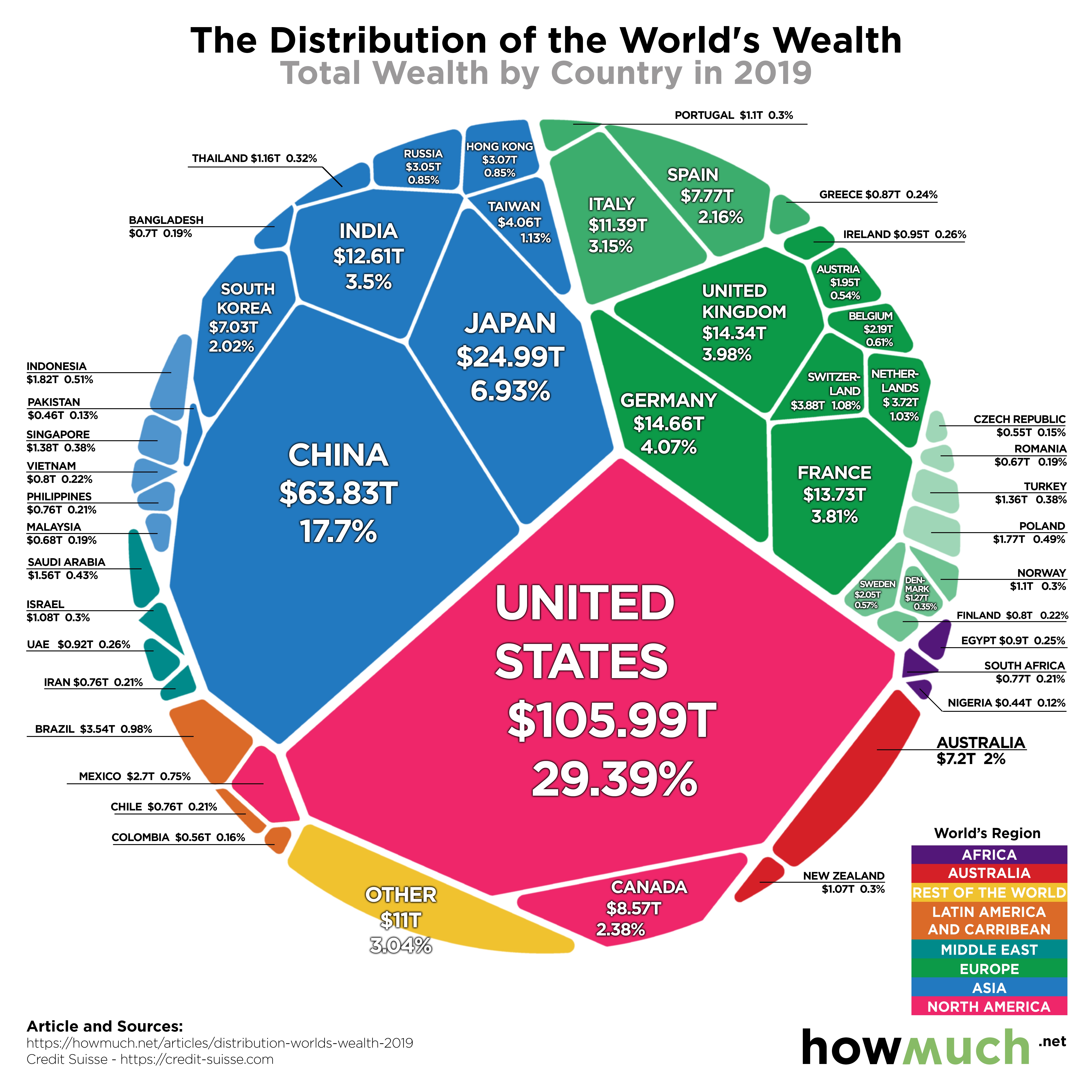
This week’s Makeover Monday was all about the wealth of the world and where it’s concentration was. The original viz looked pretty good from my view, but it did lack any ability to drill down. Also, the one thing I found that it was missing was understanding the wealth per person which is a needed indicator to better understand wealth. For example, China has a lot of wealth, but it is a lot lower on the wealth per person scale. This is not evident in the original viz, see below.
Original Viz – https://howmuch.net/articles/distribution-worlds-wealth-2019
While a good looking viz, it does have some key items missing. My original plan was to integrate plotly in Power BI using Python, but I was unable to get the viz to display correctly in Power BI. The internet searches were unfortunately not as helpful as I would have hoped. I could have done it with R in Power BI, but Power BI does not publish to web with R visuals, so I was out of luck. I then attempted to load the Plotly visual into Tableau as an embeded link, but I was unable to upload it to Tableau Public.
So, I ultimately needed to create it in Tableau.
The original data was missing a key component needed to do the analysis that I wanted. I had to find the population elsewhere and combine the data. I was able to get 90% of it merged cleanly with PowerQuery in Excel, but some of the names of countries differed between the two datasets. Those were done manually. Once done I was able to get the wealth per person metric that I needed, but first I had to convert both the wealth number (in billions) and the population number (in thousands) to whole numbers. This was a simple task and allowed for the wealth per person metric.
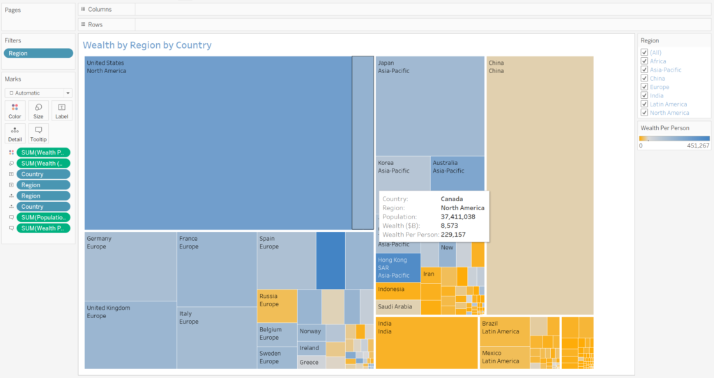
Here is my original Plotly visual that I wanted to have integrated into my dashboards.
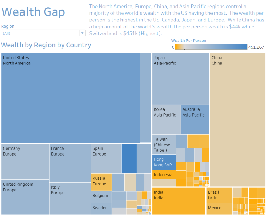
All in all it ended up better using the Tableau treemap as I was able to get exactly what I was looking for. First was getting the treemap set up in Tableau. The size is related to the Wealth in Billions segregated by region and by country. The real insight comes from the wealth per person metric which is linked to the color. So while Russia has more wealth than Belgium, the wealth per person in Belgium is higher than Russia. I used an orange to blue color scheme as it is more friendly to color blind individuals.
The next step was consolidating what I wanted in a clean format and putting in some writing. I chose to carry through the color patterns so it provided a clean look.
Great content! Super high-quality! Keep it up! 🙂